As Zoe has extended the deadlines for the SL Bloggers logo contest, I've become a victim of an impulse to create something graphical, even if only for an experiment of how digusted the readers will be about my graphic skills.
Here's my not-a-blogo for the SL Loggers: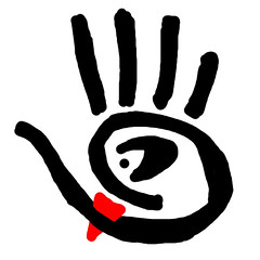
In an attempt to keep this entertaining beyond the casual chuckling, I did keep a few concepts in mind while sketching this, that I consider to be important for the blogger - and I invite you to guess what they exactly are/how are they encoded.
I'll throw in one hint about each.
1. It's about keeping the balance.
2. It's about sense of humour.
3. It's about curiosity.
4. It's about tolerance (no, it's not "his drawing skills just suck, but I be tolerant enough not to say it" - if you thought about this one, try something else)
5. It's about more than just writing.
In case you are still reading, you probably have some time, but don't feel like joining the olympic games in volumetric typing - so, welcome to the comments :)
(p.s. And for once, this has nothing to do with opensim)
Wednesday, September 5, 2007
SL Bloggers not-a-logo
![]()
Subscribe to:
Post Comments (Atom)

4 comments:
I like the remix of SL logo. Not sure if it is allowed to be used, but if they say just a single word I will rant ad infinitum.
I like the ear also. Yes, that point of "not just about writing". Great one.
I don't have a clue what is the red triangle there. At the first glimpse I thought it is turntable's head. But I guess that is half of my brain dreaming already.
the red triangle is about #2 :-)
the ear: heh, interesting, I thought i did not have any here - but hey, I did put in the disclaimer about my drawing skills - that's why it's not-a-logo :)))
Really, it's not that bad. Who said all logo's should be vectors? =d (And well, it should be vector, but no one said the vectors should be smooth. ;))
I like that you actually thought about why this logo, something which is often forgotten. Logo's should not just look neat, they should have a 'meaning' too, imho. =)
*me feels flattered* :)
yes, i do like logos with a "sub-text" :)
Post a Comment